New York City Housing: Visualizing Housing Quality Over Time
Background:
The New York City Housing and Vacancy Survey (NYCHVS)[^fn1] is a conducted roughly every three years on a large representative sample by field representatives of the Census bureau and sponsored by the New York City Department of Housing Preservation and Development. It is one of the longest running survey in the country, with data going back to 1965. Roughly every decade a representative sample of housing units are selected to represent the core sample between the three-year periods. Both occupied and vacant units are monitored with formal interviews being conducted on inhabitants of occupied units. Variable sets are somewhat consistent overtime with notable additions and revisions over time. The data set largely consists of categorical data concerning housing condition, inhabitant demographics, and unit characteristics such as rent control.
Introduction:
New York City is an exciting population to collect data from due to the complex nature of the city structure and culture, nationwide trends are often incongruent with the densely populated streets of New York. Over the past five decades New York City has seen dramatic transformation, incomes have risen, crime has fallen, and housing conditions have improved considerably. However, significant portions of the city still live in deteriorating or dilapidated structures. It is of interest to investigate how housing quality has varied over time and which inhabitants face the harshest conditions. Quantifying housing conditions can be difficult as many measures cut the housing distribution too coarsely.
In March of 2013 the U.S. Department of Housing and Urban Development published American Housing Survey: A Measure of (Poor) Housing Quality[^fn2], which detailed a process for creating a robust index to measure poor housing index which they name the Poor Housing Quality Index (PQI). Given the similar structure of the American Housing Survey and NYCHVS we will use their approach as a general guideline for modeling housing quality in New York City.
Approach:
We will consider data from 12 surveys collected from 1991-2017 in all five borough of New York city, and construct our index by measuring the prevalence of physical deficiencies impacting units in the city. The index will formally be defined as the weighted sum of indicator variables. The weighting of indicators is largely uniform with minor adjustments by the author. The difference in weights is subjectively determined, for example it is the authors opinion that a unit with broken or missing windows is in worse condition than a unit with broken plaster or peeling paint. The author has no data regarding the extent of these deficiencies and further analysis for choosing optimal weights is recommended.
We have attempted to calculate our index from a consistent variable set overtime, however some of the variables are only collected in later years. Variables only collected in future years are assumed to be zero in prior years. That is, if data for a variable is not available or missing, we award units the benefit of the doubt and assume that the issue is not present. A full breakdown of the index is available below.
| Item | Description | NYCHVS Variable | Score |
|---|---|---|---|
| 1 | Exterior Walls: Missing brick, sliding or other | d1 | 2 |
| 2 | Exterior Walls: Sloping or bulgin walls | d2 | 2 |
| 3 | Exterior walls: Major Cracks | d3 | 2 |
| 4 | Exterior Walls: Loose or hanging corvice, roof, etc. | d4 | 2 |
| 5 | Interior Walls: Cracks or holes | 36a | 2 |
| 6 | Interior Walls: Broken plaster or peeling paint | 37a | 2 |
| 7 | Broken or missing windows | e1 | 5 |
| 8 | Rotten or loose windows | e2 | 2 |
| 9 | Boarded up windows | e3 | 3 |
| 10 | Sagging or sloping floors | g1 | 2 |
| 11 | Slanted/shifted doorsills or frames | g2 | 2 |
| 12 | Deep wear in floor causing depressions | g3 | 2 |
| 13 | Holes or missing flooring | g4 | 2 |
| 14 | Stairs: Loose, broken, or missing stair | f1 | 2 |
| 15 | Stairs: Loose, broken, or missing setps | f2 | 2 |
| 16 | No interior steps or stairways | f4 | 2 |
| 17 | No exterior steps or stairways | f5 | 2 |
| 18 | Number of heating equipment breakdowns | 32b | 2 per break down |
| 19 | Kitchen facilities fucntioning | 26c | 3 if no; 5 if no kitchen facilities |
| 20 | Toilet Breakdowns | 25c | 3 if any; 5 if no toliet or plumbing |
| 21 | Presence of mice or rats | 35a | 3 |
| 22 | Water Leakage | 38a | 3 |
Note that financial data, such as rent or income, are not included and this is intentional. Many intuitively infer that income strongly impacts, or predicts, one’s living conditions. However, our measure of housing quality is very far from describing all the nuances of hosuing quality, measuring only observable physical deficiencies. Our subjective ideas of quality of living are only loosely captured at best. As such we wish to explore the relationship between our index and income and thus would not want to include something like income in the measure itself as the relationship would be confounded. The complexity of the relationship is later explored.
Evaluating the Index
Now that we have designed an index for measuring poor housing quality let’s consider an example of how it works in practice. Consider a unit with boarded up windows, two heating equipment breakdowns, and no toilet or plumbing. Then this unit would score: 3 + 2(2) + 5 = 12 on the Poor Housing Quality Index. Likewise, a unit with no detected issues would be 0. A note is in order, our index is an ordinal measure meaning that while unit with a PQI of 6 is measured as worse than unit with a PQI of 3 it is not twice as bad, and due to both the coarse nature of data and subjective weighting it is not necessarily a “better or worse” place to live. Even so, the PQI is a useful tool for gaging housing quality..
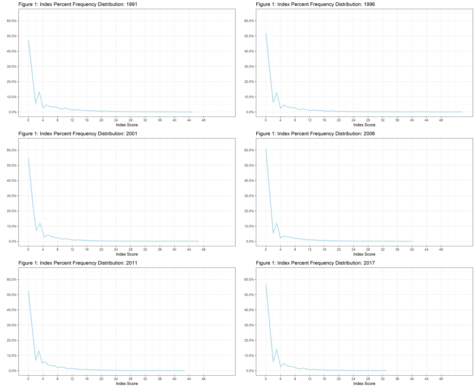
With some understanding of PQI, let’s look more in depth at how our index is performing, what it might tell us, and how it varies over time. The first plot we are going to look at is a frequency distribution of PQI. It shows the percent (Y axis) of housing units at each index value (X axis). Further, I have animated the graphic to show how distribution changes from year to year. Note that data is only collected in 1991 and triennially from 1993-2017, and any intermediary frames are just interpolated values to make the animation flow.

The most noteworthy point here is that in almost every year a majority of houses score have a PQI of zero, i.e. no detected deficiencies. The year 2008 had the highest number of units with an index score of zero (64%). Second note that the distribution is robust with respect to time implying that our defaulting of missing values to zero is biasing the data. The highest observed PQI value was in 1993 with a score of 54 points! We can also see a general trend of more units measuring zero and less extreme PQI scores as we progress through time. This shifting distribution is further detailed in the two interactive figures below.
These figures largely show the same information, but in two perspectives. The first makes it clear how the index functions and how we might begin to think of index values. For example, we might think of a unit with a PQI between 11 and 20 as being a unit with significant deficiencies, and a unit with PQI > 20 as having severe deficiencies. In both figures we see an overall downward trend in index scores indicating that housing quality is improving over time.
Now many questions start to arise. What is driving the improvement in housing units over time? How does it relate to variation in income? Rent? We’ll attempt to answer some these question and more in a future post.
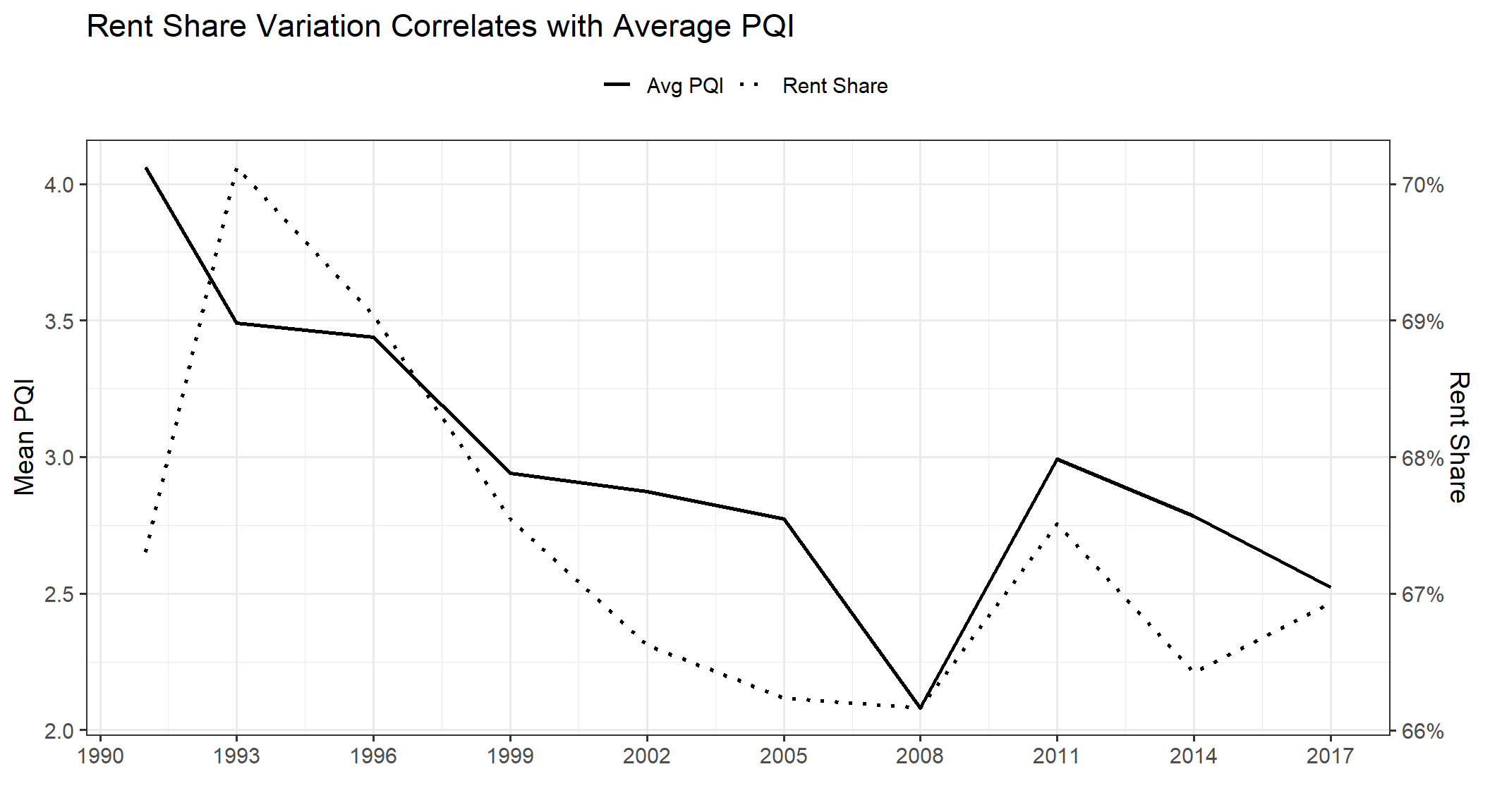
Rent has a big impact on quality
More coming soon…
 ## References
[^fn1]: https://www.census.gov/programs-surveys/nychvs.html
[^fn2]: https://www.huduser.gov/publications/pdf/AHS_hsg.pdf